

SCBC REDESIGN
Creating a responsive website to elevate user engagement and boost website traffic.

7 min read
TIMELINE
Aug 2023 -Present
DESIGN ROLE
Lead UI/UX Designer
SECTOR
Education, Lifestyle, Non-Profit
Introduction
Sandy Creek Camp is an Austin based organization whose mission is to provide transformative experiences through summer camps, weekend youth retreats, and more. Since 1974, they've been weaving a tapestry of lasting memories and meaningful encounters, through their full-service rental and camping facility.
The challenge was to explore ways in which the website could extend its appeal to individuals from distant locations.
The primary business needs we defined were:
Cultivate a greater understanding and awareness among our community about the meaningful impact of our programs
Encourage individual contributions and engagement to amplify the impact of the Camp's existing initiatives.
Problem


Goal

Build trust, boost awareness, and empower individuals to actively participate in the camp community.
The aim to create a digital platform that fosters transparency, encourages participation, and amplifies the impact of the camp programs.

Research
User Research
To gain a better understanding of how I could more effectively address this problem, I conducted a series of user interviews and surveys. Questions I asked included:
Tell us more about your interests and the type of activities you enjoy participating in?
How do you typically discover information about camps or recreational retreats?
Which platforms or sources do you find most effective for learning about such opportunities?
When deciding to engage with a camp or recreational facility, what factors influence your decision the most?
What specific elements or features are you looking for in their offerings?
Are there any challenges or barriers that limit your participation in camps or recreational events? If so, what are they, and how do they affect your willingness to get involved?
Uncovering the barriers to involvement
FindingsSome of the major pain points we identified included:
People felt they didn’t have enough time, money, and educational resources to contribute
People wanted to be more involved but were unsure where to start
People felt like they couldn’t make a difference on an individual level
People wanted to validate that organizations were trustworthy and aligned with their values
After surveying 10 participants and conducting 4 user interviews, I used affinity mapping to find common themes in the data I collected. As a result of this activity, I was able to discover several major trends that I needed to address in the next phase of our design process.

Some of the findings and statistics we gathered from our user surveys and interviews
CURRENT USER JOURNEY MAP
To capture the current user experience on the Sandy Creek Camp website, I crafted user journey maps. These maps aim to depict various scenarios where a user might engage with the camp's website, such as the process of exploring volunteer opportunities and deciding on participation in camp activities.
User Journey Map depicting the current user journey when they ‘sign up as a volunteer’ or ‘register as a student’.
Research Synthesis
User Archetypes
Based on the patterns identified in the affinity map and secondary research,I came up with a primary user archetypes:
The Outsider: Someone intrigued by the offerings of Sandy Creek Camp, curious about engaging in spiritual and recreational activities, yet uncertain about where to begin or how to actively contribute to the camp community.
Active User: A highly engaged member of the community
Passive User: A user who is more active when events happen at the camp, dropping off once the event ends.
CURRENT SITE ANALYSIS
Upon reviewing the current SCBC website, my analysis revealed a predominant focus on catering to organizational needs rather than individual users.

COMPETITOR ANALYSIS
To gain inspiration and identify best practices for the website redesign, I conducted a competitor analysis. I began by looking at the websites of several other non-profit organizations including Still Water Camp, Freshair Camp and Deercreek Camp.

Common design pattern: Donate button placement
FindingsThere are missed opportunities for a better experience by fixing minor inconsistencies in style and being more transparent with information.
SUMMARY OF OPPORTUNITIES
The strategic placement of "Register Now" and "Donate" buttons, highlighting them as primary calls to action.
Prominently displayed their mission statement at the beginning of the homepage.
Design
PAPER WIREFRAMES
I initiated the process by translating research insights into tangible design ideas. Through a series of individual sketches, I presented various concepts for the website layout. The iterative nature of this approach involved receiving feedback, refining the sketches, and aligning the designs with the camp's specific needs.

Paper Wireframes

Lo-Fi Wireframes
After presenting the lo-fi wireframes to the client for feedback, it became evident that there was a need for a more streamlined approach, considering the client's constraints regarding frequent updates. The client said they couldn't keep updating the team section in the “About Us” page because their staff kept changing. To address this, I suggested eliminating the section and consolidating relevant content into a single page. This streamlined approach alleviated the client's concerns about constant updates while maintaining essential information accessibility. Additionally, I utilized this opportunity to gather additional client feedback and incorporate their requests into the design iteratively.

About Us Page Iterations
USABILITY TESTING
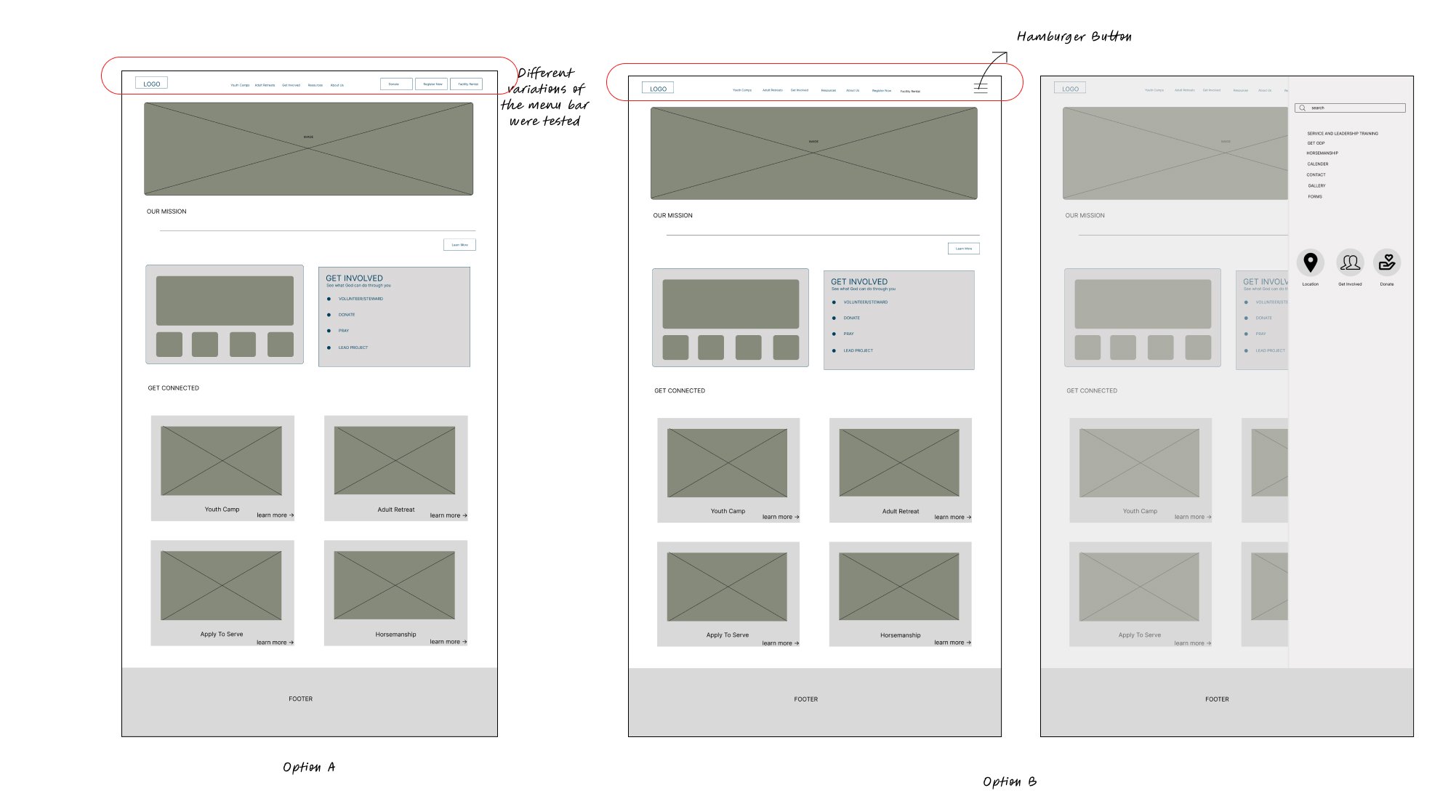
During the usability testing sessions, I presented participants with two variations of the menu bar and homepage design (A/B Testing) to gather feedback and insights. Participants interacted with both options while completing tasks and provided feedback on their preferences, ease of navigation, and overall user experience.
Findings92% of users prefer having direct access to the action buttons in the menu bar rather than using a hamburger menu.
78% of users advocate for retaining the "Donate" button as an action button in the menu bar, even though it is currently located within the "Get Involved" section
The addition of a separate "Our Stories" page was unanimously embraced by 99% of users, elevating trust and perceived value of the website significantly.
The "About Us" page proved invaluable to 97% of testers, providing crucial insights into camp leadership and instilling confidence among parents considering sending their children to the camp.
Positioned strategically on the landing page, the "Get Involved" section garnered high praise from 96% of volunteers, streamlining the sign-up process and encouraging greater engagement with the organization.
MID FIDELITY WIREFRAMES
The new user journey is optimized for an increased satisfaction rate.
The new user journey is optimized for an increased satisfaction rate.


Homepage

Volunteer Page

YouthCamp Page

Our Stories Page
About Us Page
Design System
After finalizing the functional aspects, my attention shifted to the user interface (UI) design. The subsequent step involved the creation of a comprehensive design system, ensuring a cohesive and visually appealing framework.


High Fidelity Wireframes
HOME PAGE
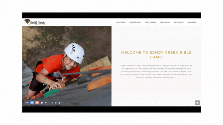
Before
✅I ensured responsiveness by integrating mobile and tablet versions for a seamless user experience across devices.

After

Appearance
Made the page more colorful
Lots of rounded corners and squircles :)
+ The main homepage features a dedicated 'Get Involved' section, streamlining user participation in volunteering, prayer, leadership roles, or donations.

Visual-forward Menu bar with drop downs
For easier scanning and reducing information load.
✅To enhance user engagement, I incorporated a prominent "Register Now" ,"Facility Rental" and “Donate Now” button, accentuated with a distinctive green color to capture immediate attention.
My original plan didn’t work out..
Initially, I considered using the existing "About Us" page to build trust. However, I ultimately decided to split it into two separate pages: "Our Stories" and "About Us." This required creating a new page from scratch but proved more effective in meeting the client's goals and enhancing user trust and engagement.

SOME PROMINENT FEATURES
Establishing trust and confidence
A prominently displayed mission statement on the homepage, offering a clear statement of the camp's purpose.✅
An informative 'About Us' page providing users with a deeper understanding of the camp and its leadership.✅
A dedicated 'Testimonial' section highlighting the impact of individuals, fostering credibility and trust.✅
An engaging gallery showcasing images of previous camp experiences.✅
“Our Stories” page featuring personal testimonials from people impacted by or involved with the camp✅

About Us
Our Stories page
Bringing new volunteer opportunities to the table

Volunteer Page
An easier way for volunteers to sign-up
Dedicated volunteer sign-up page✅
Section to accommodate inquiries from users with unique skills✅
Delivering a more streamlined Registration process

To be honest..this page was the hardest for me to design. It is a sign-up page showcasing camps programs; It is a long page and has a lot of critical information. I didn’t want it to boring visually, so tried ‘pop on hover’ design to make it interesting for the users.
A closer look…

PROTOTYPE
Designing for web has its own unique challenges. Working closely with developers and the client helped me learn the limitations that arise when creating a product for the web.
Conclusion
The 4 ways I would like to improve this project...
Record the original onboarding’s first impressions of 5+ new users other than myself
My view holds a lot of bias (especially as a designer) and I’d be sure to gain more insight with more perspectivesThorough research on SCBC’s competitors, their offerings, and how they sell it
User rates can be further improved by showing how SCBC differentiatesTest the final prototype with more users and make adjustments for improvement
Can help challenge the assumptions I made in my designCarry the re-design onto the other screens
I would love to re-design all the screens to make the website more cohesive
Thank you!:)You've reached the end...why not take a look at my other projects?

