
MATRIARCH
Pathway to independence.

7 min read
TIMELINE
Nov 8th -10th (3 days)
DESIGN ROLE
Product, UX/UI, Research
SECTOR
Lifestyle, Education, Mental Health
Introduction
This project was part of the 3 day Hackathon run by Girl Develop It Community from Nov 9th- 11th (2023). Our team was placed 3rd in the challenge, out of a total of 15 teams. I had a lot of fun with the prompt and was inspired by the teams dedication, and the purpose behind developing the app.

Problem

Matriarch is a mobile app that helps users on their journey toward self-sufficiency and peace of mind more effectively by connecting them with independent professionals and community resources.
Empower foster care graduates through community connections.
Goal
What is Matriarch aiming to do?
Individuals transitioning out of the foster care system often face challenges in achieving self-sufficiency. Our goal is to provide assistance by connecting them with independent professionals and community resources through a mobile app, ensuring easy access to essential services and support.


THE TEAM
BRAINSTORMING
I started by narrowing the scope of my design by figuring out what type of app I was designing for with the leading question:
What information does the Dashboard section provide and what kind of app can to make the most out of it?
“How may we empower individuals on their journey toward self-sufficiency and peace of mind more effectively by connecting them with independent professionals and community resources through a mobile app, ensuring they can readily access essential services and support?”

Some ideas that came up during the design sprint.
DESIGN SPRINT
We conducted an intense brainstorming session involving the entire team to ideate on potential features and functionalities for the Matriarch app using FigJam and Zoom.
We prioritized features by voting on their significance in addressing the identified needs of the user personas. Key features included:
access to therapists
community resources
goal-setting tools
support network.

figjam file documenting our thought process.
Research
We designed a set of direct questions aimed at understanding the struggles of individuals leaving the welfare system. We also leveraged the personal experiences and insights of the team member who had first hand experience with foster care. Our primary objective during user interviews for the Matriarch app was to gain a deeper understanding of why users might disengage after reaching certain points in the app, particularly in the process of connecting with a licensed therapist and developing a personalized independence plan. Additionally, we aimed to uncover insights into motivating users to actively participate in the collaborative development of their independence plan.
Our overarching questions included:
❓ How do users typically seek support in connecting with a licensed therapist through online platforms?
❓ What specific information do users require to engage in the process of developing a personalized independence plan?
❓ What potential obstacles or challenges do users encounter when navigating the app and seeking support for their unique needs and challenges?
COMPETITIVE ANALYSIS

A competitive analysis was conducted to assess the search functionality of several direct and indirect competitors. This helped us identify some common functionalities and gaps that we could potentially address.
Since we were tight on time( 1.5 days to do research and design), we quickly looked at the designs of the competitor apps to figure out how to place ourselves.

USER PERSONA
Drawing upon the valuable insights shared by team members with lived experiences, we meticulously developed personas that encapsulate the diverse challenges and aspirations of individuals transitioning out of foster care. The persona vividly illuminate the distinct needs and goals that shape their unique paths toward independence.

JOURNEY MAP
To deepen our understanding of users and comprehensively grasp their challenges throughout various stages of engagement, we crafted journey map. The map aim to illuminate the specific pain points experienced by users at every step of their journey, providing valuable insights for enhanced empathy and user-centric improvements.
Lilly just came out of the foster care system and is trying to join courses that can make her self sufficient. She is also trying to find a licensed therapists specializing in supporting individuals transitioning from foster care.

FindingsThese insights provide a foundation for addressing user pain points and improving the Matriarch app to better meet the needs of its users, ultimately enhancing the overall user experience.
😔 Users feel lost due to a lack of guidance within the app.
⏱️ Users find the onboarding process irritating and time-consuming.
😨 Users express uncertainty in choosing the best options for their needs.
😤 Users feel frustrated due to perceived insufficient motivation and support.
Design
Leveraging the insights from our brainstorming session and user stories, we quickly translated those ideas into wireframes. These wireframes mapped out the landing page, home page, login and sign-up flows, and the dashboard.
The aim was to create a clear, intuitive interface that would guide users through their journey towards independence.

The (slightly unreadable) initial Sketches.
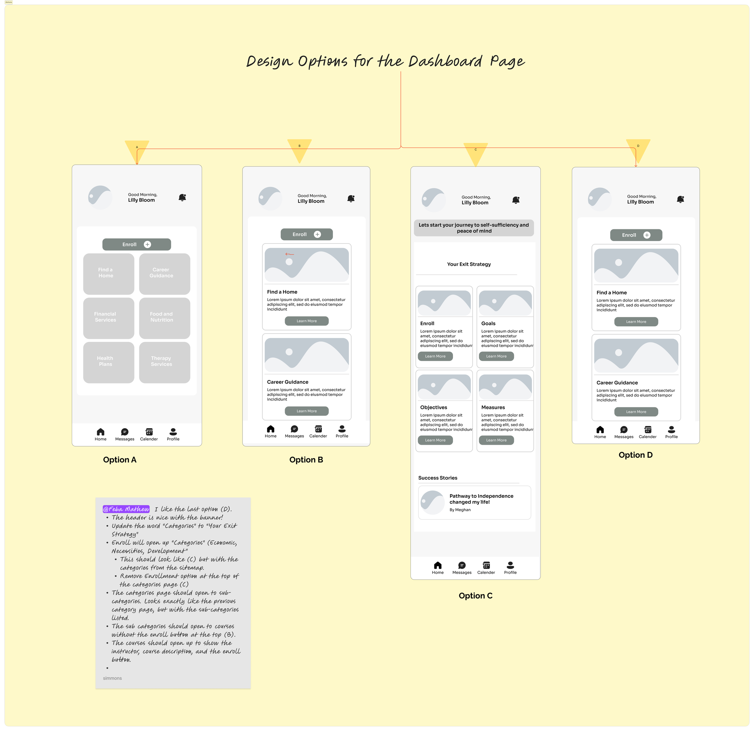
Initial Lo-fi Wireframes for the Dashboard Page
Different layouts for the dashboard page I presented to the team. The idea was to get inputs from fellow designers, product owner and developers before proceeding to the hi-fi designs. After some discussions and voting we decided to go with option D.
SITE MAP
Home/Dashboard
A welcoming landing page offering personalized content and quick access to key app functionalities.Courses
Explore a diverse range of courses aimed at guiding users towards financial stability, therapy, support, and home ownership.Therapists
Connect with licensed therapists who can provide personalized support tailored to individual needs.Roadmap
Collaboratively develop and track a personalized independence plan, addressing unique challenges and goals.User Profile
Manage personal information, preferences, and track progress within the app.

Site Map for the App
DESIGN SYSTEM
Expanding on the initial wireframes, we created a foundational UI that aligns seamlessly with the branding and visual identity of Matriarch. The user interface was thoughtfully crafted to prioritize user-friendliness and accessibility, recognizing the sensitive nature of the app's purpose.

An onboarding that informs and excites.
FINAL SCREENS

A positive onboarding experience, utilizing this chance to introduce Matriarch’s differentiating features, get users excited about using the app, and additionally build brand trust.

Creating a visual representation of the different stages and pathways to independence through the app to enhance accessibility and usability for all users.
Stages + how to progress

Success stories llustrating how accessible resources can empower foster care graduates to pursue higher education..
Success stories to build trust
Usage of cards for easy navigation

Feedback Mechanism
This section allows users to provide feedback on the app's usability and effectiveness. This is strategically placed in the courses page to helps newer users to stay motivated and achieve independence.

PROTOTYPE
Conclusion
I am proud. of what we achieved, especially given the time constraints and the ambitious objective of developing a tool for such a significant cause. It was a really fun learning experience being able to get into the nitty gritty details of every single design choice. I ran into quite a few unexpected ideas as I was nearing the end of my project such as the reviews and feedback which really helped tie it all together!
WHAT I LEARNED
1. Peer feedback saved the project
I asked two other designer friends to look over my project and they challenged all of my design decisions, making sure there was valid support behind everything.
2. Storytell the process
I put extra effort into organizing the Figma file for this challenge and had a lot of fun structuring it as a story for easier digestion. It also made referencing everything easier for this case study:)
SOME THINGS I WOULD DO DIFFERENTLY...
Spend more time polishing the interviews, ensuring the wording is as concise and unbiased as possible
Show my wireframe designs to the testers/developers to get their feedback and remove some of my own assumptions
Video interview more candidates to get more candid and detailed answers from them which would hopefully help form some better insights

Thank you!:)You've reached the end...why not take a look at my other projects?

Product Design

UX/UI Design